Anatol Knotek defines himself as a “visual poet” and no other definition could fit him better.
Born in Wien in 1977, where he still lives and works, he has been inspired by concrete poetry and typewriter art, discovering the importance of the word both in its form and its content.
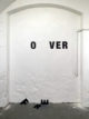
His minimalism is rich in meaning and his way of using letters, instead of colors, produces a visual poetry that is sometimes playful and sometimes thoughtful.
We had a chat with Anatol Knotek on art today, his inspirations and his creative process.

We can say that the raw material of your art is the letters of the alphabet. Singular choice yet very effective. How did you come up with this idea?
That was a quite long process. I started moving away from painting about twenty years ago and gradually replacing the colors with texts.
The first results were collages, which looked very similar to my previous paintings in terms of content and shape. However, all surfaces and contours consisted of a collage of collected texts, poems and newspaper clippings.
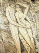
“Dance of life 2” is a good example of my work at that time. Later I discovered the poems of the concrete poets of the fifties and sixties which influenced me strongly.
What is the reaction that you would like the viewer to have in front of one of your works?
First of all, I would like to say that the possible reaction of the viewer does not flow into my work process in the beginning. It is my own feeling about an initial idea that causes me to continue the work or to drop the idea.
But of course I am happy when my work stimulates the viewer to think in a certain way, or when my art brings a smile to the face of the viewer!
Tell us about your creative process.
I spend a lot of time online to research about text-based art and fill my blog. By researching and visiting many exhibitions on this topic, I have developed many ideas over the years. I write them down in my analog notebook and let them mature. After weeks or months I pick up old notes (if they still seem relevant to me) and continue to work on them. The next step is usually a draft on the computer, before I start working on the real implementation.
How do you think making art is influenced by social media today?
I can only speak for myself here, but I think that it has a certain influence of social media on my way of doing art and how I present art. Art is about expressing your own ideas but also reacting to your environment or orienting yourself to other artists. Nowadays it is very easy to follow current exhibitions from all over the world simply by taking your mobile phone with you. It has never been easier to orient yourself to other contemporary artists or to be inspired by the way in which you present yourself.
The minimalist choice of your works includes also the colors. Is there a reason behind the predominance of black and white?
Back when I started to get interested in art, I tried to be a very colorful artist! I was quite influenced by the expressionists and I tried my best to emulate this movement. The “problem” was (or still is), that I don’t see and use the colors as most people do, because I have a red-green color vision deficiency.
This fact and the discovery and fascination for text-based art made me refrain from using colors more and more in my early twenties and lead to the work I’m currently doing.

You call yourself a visual poet, but which part do you think is more prevailing in your works: aesthetics or content?
If that is in balance I am most satisfied – both is equally important to me!
In some of your works, the influences of Masters of art such as Fontana and Burri are clear. Which Movements and artists inspire you the most?
This is really difficult to say, because I am always looking for inspiration from various artistic sources. I am currently very interested in typewriter art again. The work of Dom Sylvester Houédard, a Benedictine priest and typewriter master, is a great source of inspiration! I am also particularly interested in Art Brut and especially in the work of the artists from Gugging, whose spontaneous and seemingly uninfluenced approach to art is fascinating. Concrete & intelligible art and outsider art obviously contradict each other – but that is precisely what fascinates me. I often try to find something new through the possibilities of combination, and even if these combinations or influences are sometimes not clearly reflected in my art, they serve as a play of thought and source of inspiration to think about new possibilities and to go one step further, instead of sticking to the same way of thinking over and over again.
If you’d be a typeface, which one would you be?
Either Helvetica Neue or a Sans Serif Monospace font 🙂